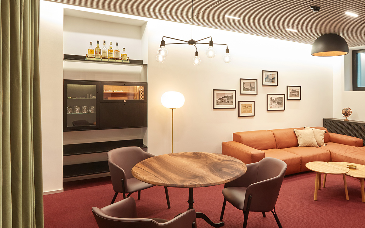
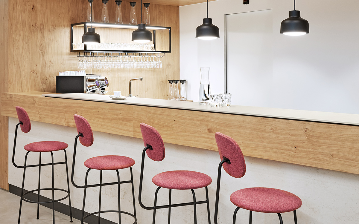
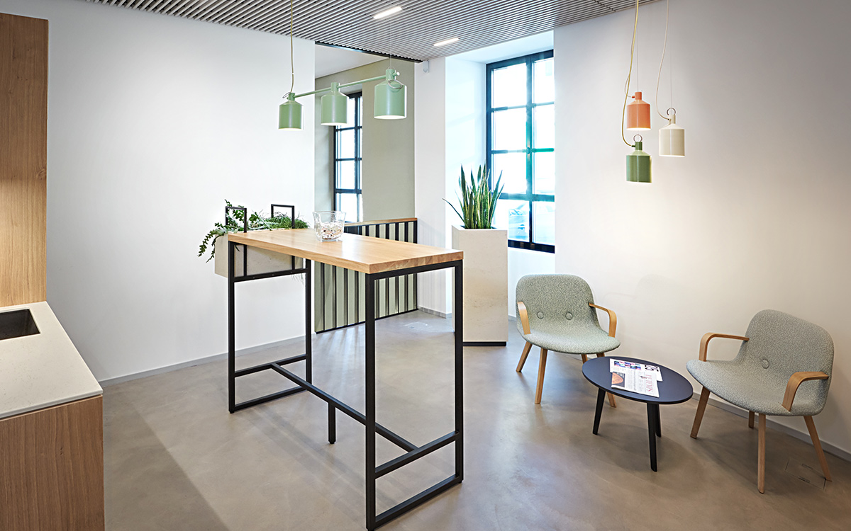
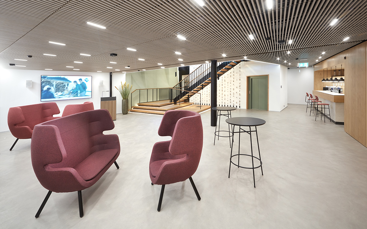
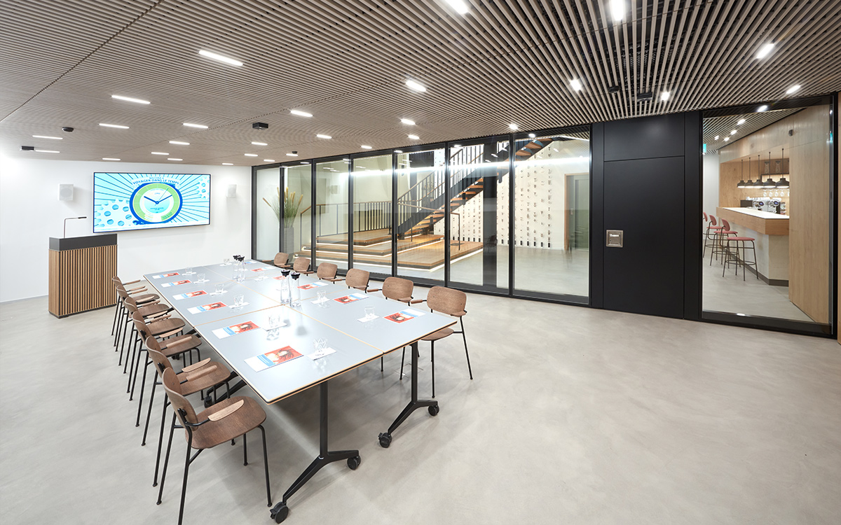
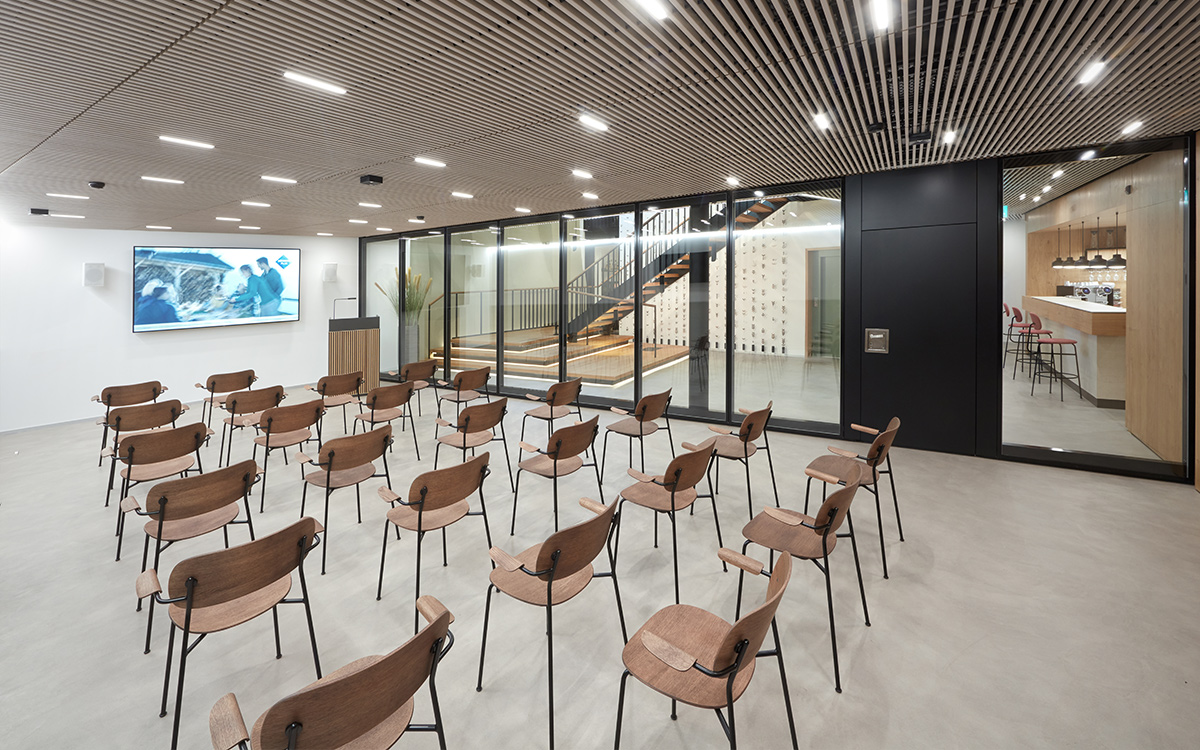
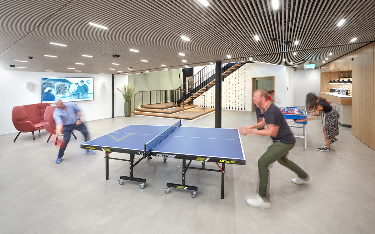
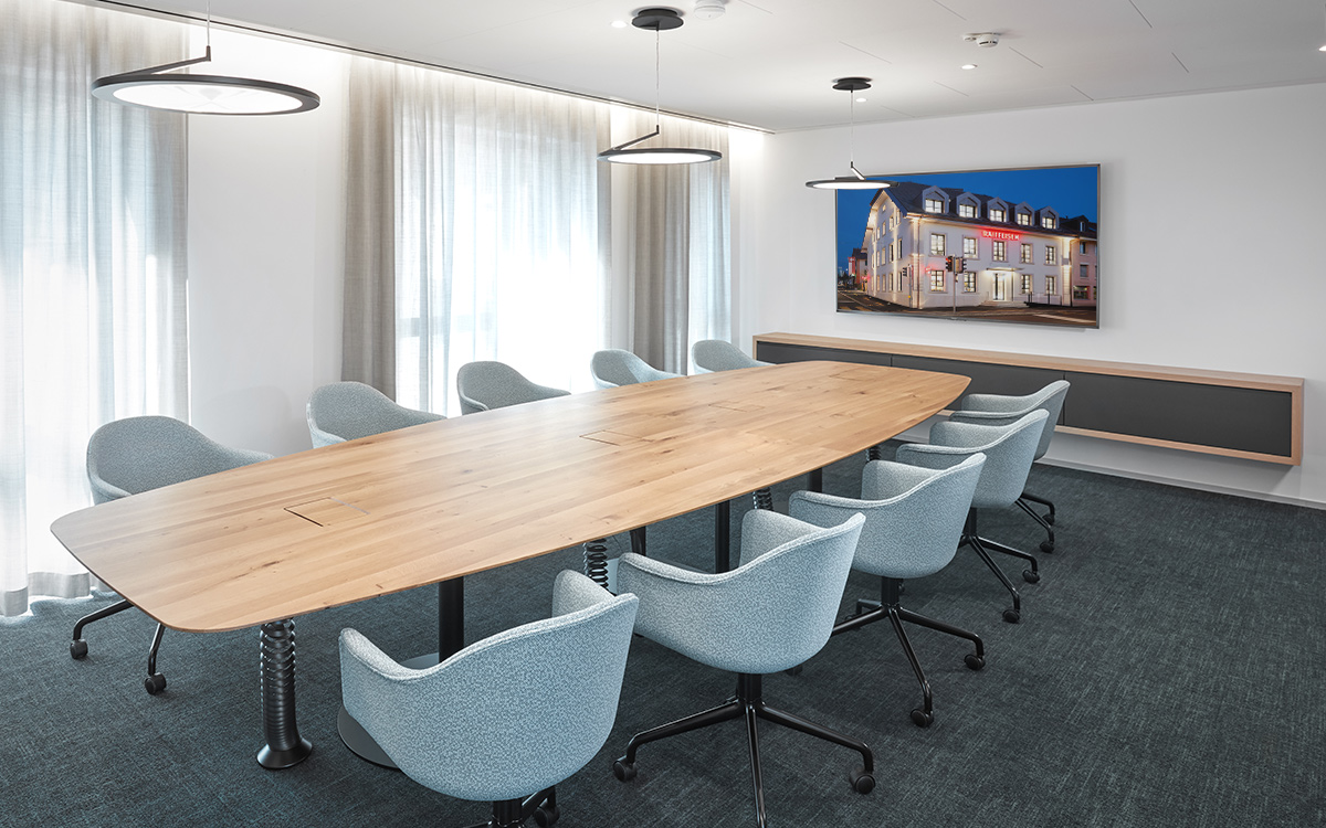
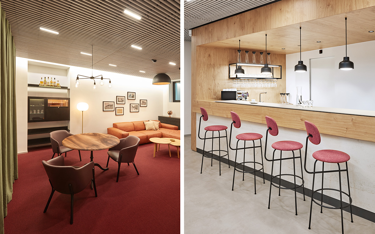
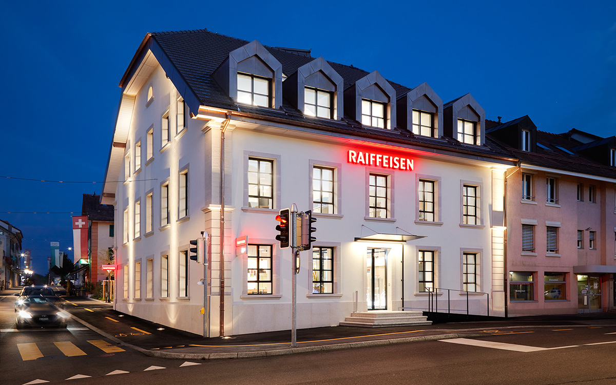
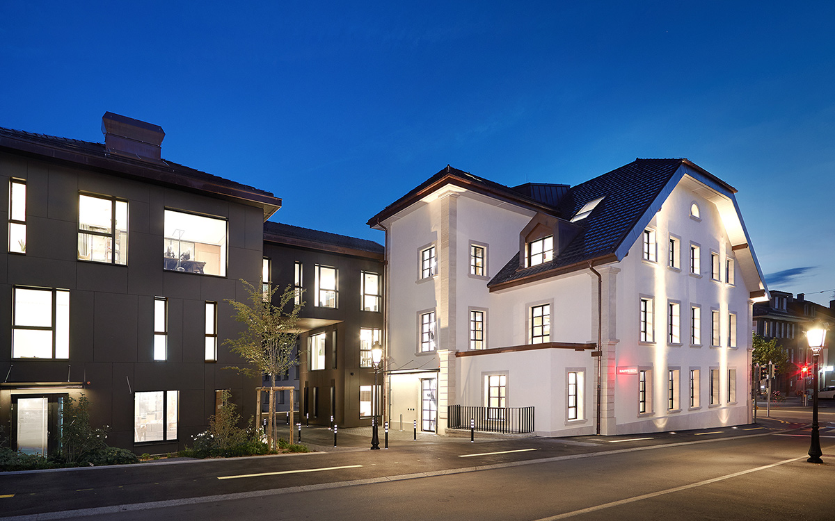
The different storeys with their meeting rooms, the conference room and the cafeteria are entirely geared to the needs of the staff.
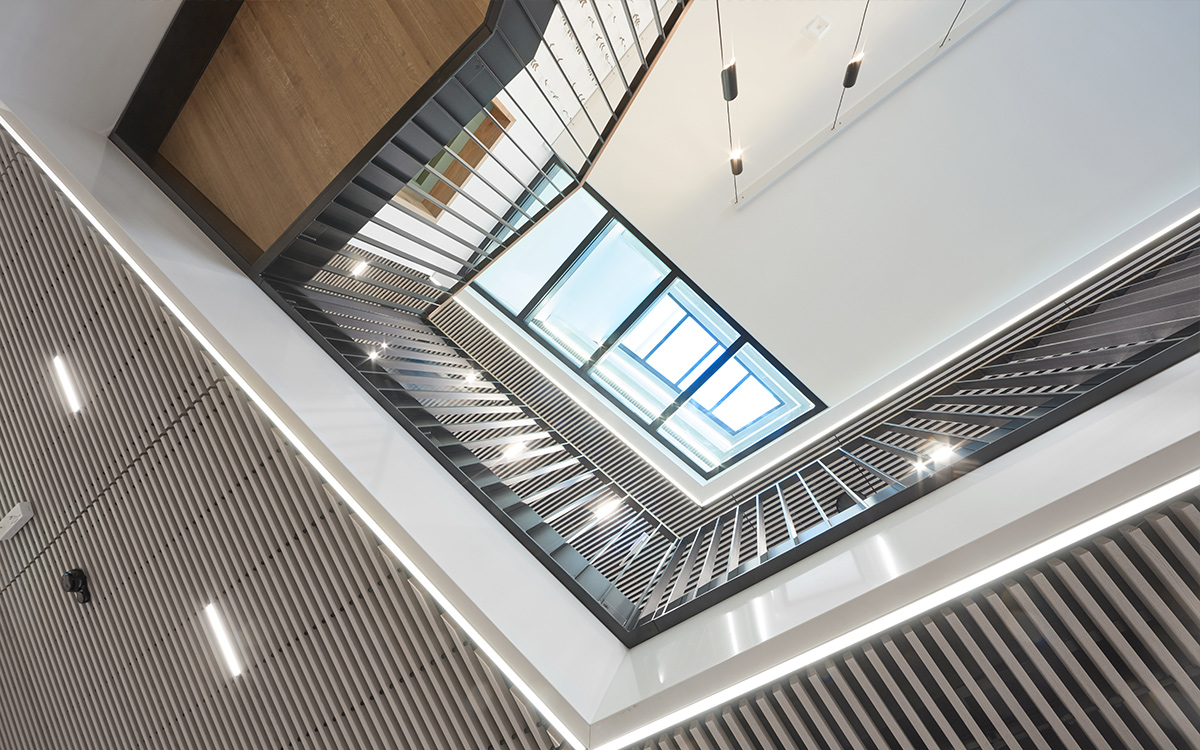
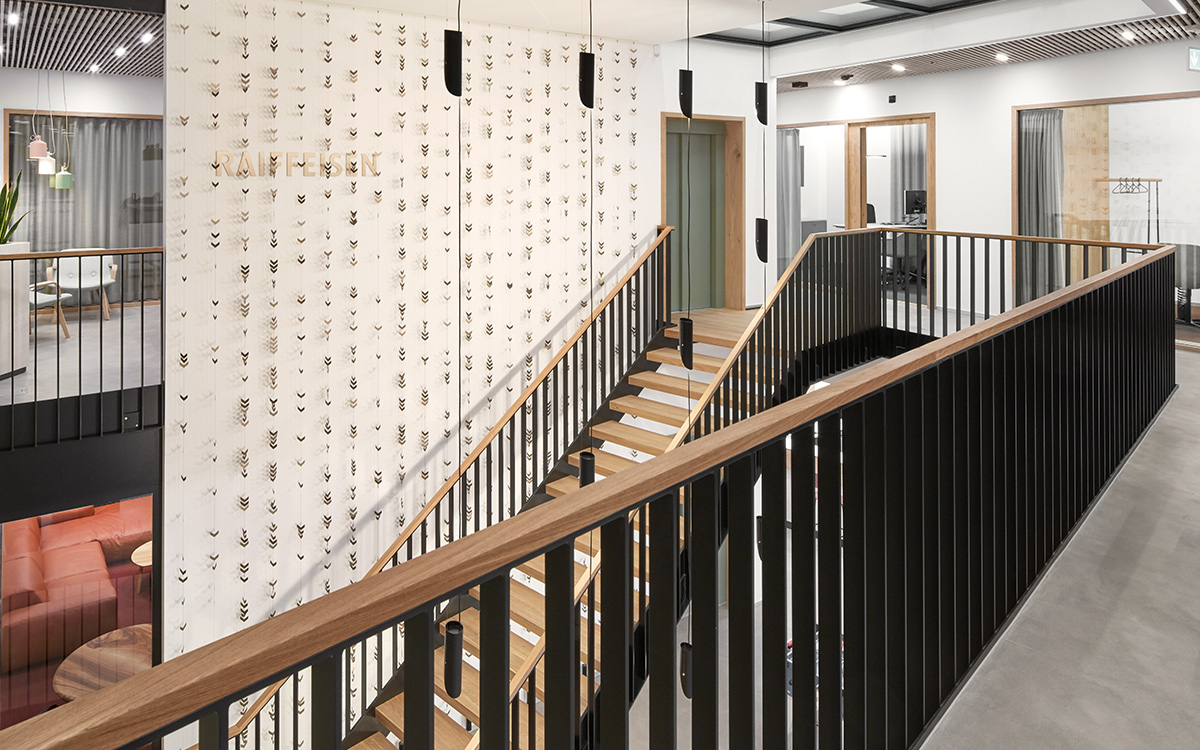
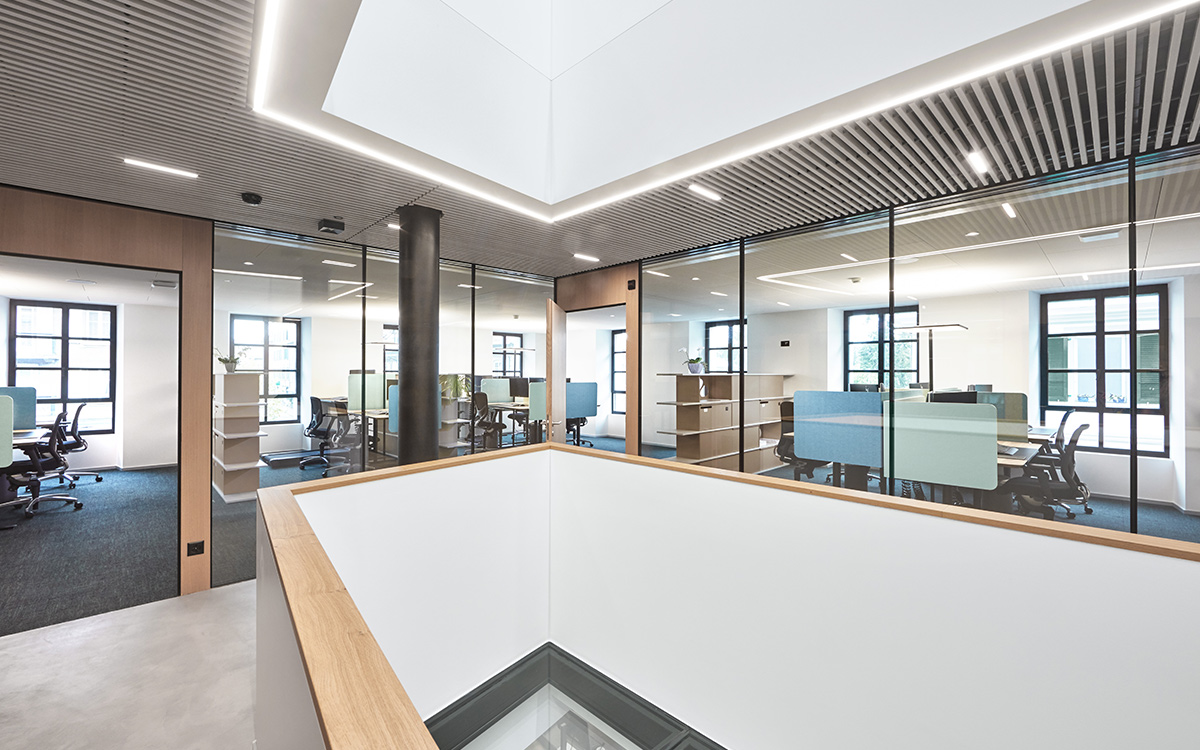
Light was a central theme of the conceptual plans. And our response was to create a light well that bathes all floors in natural light.
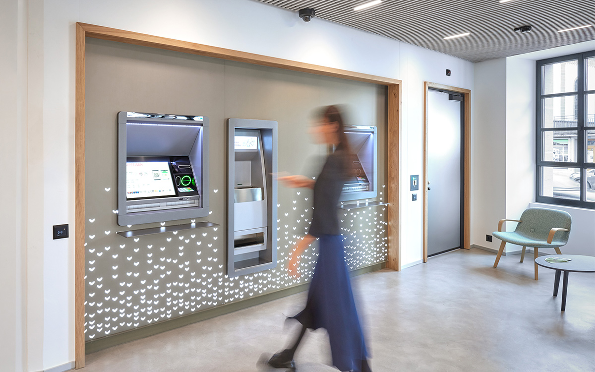
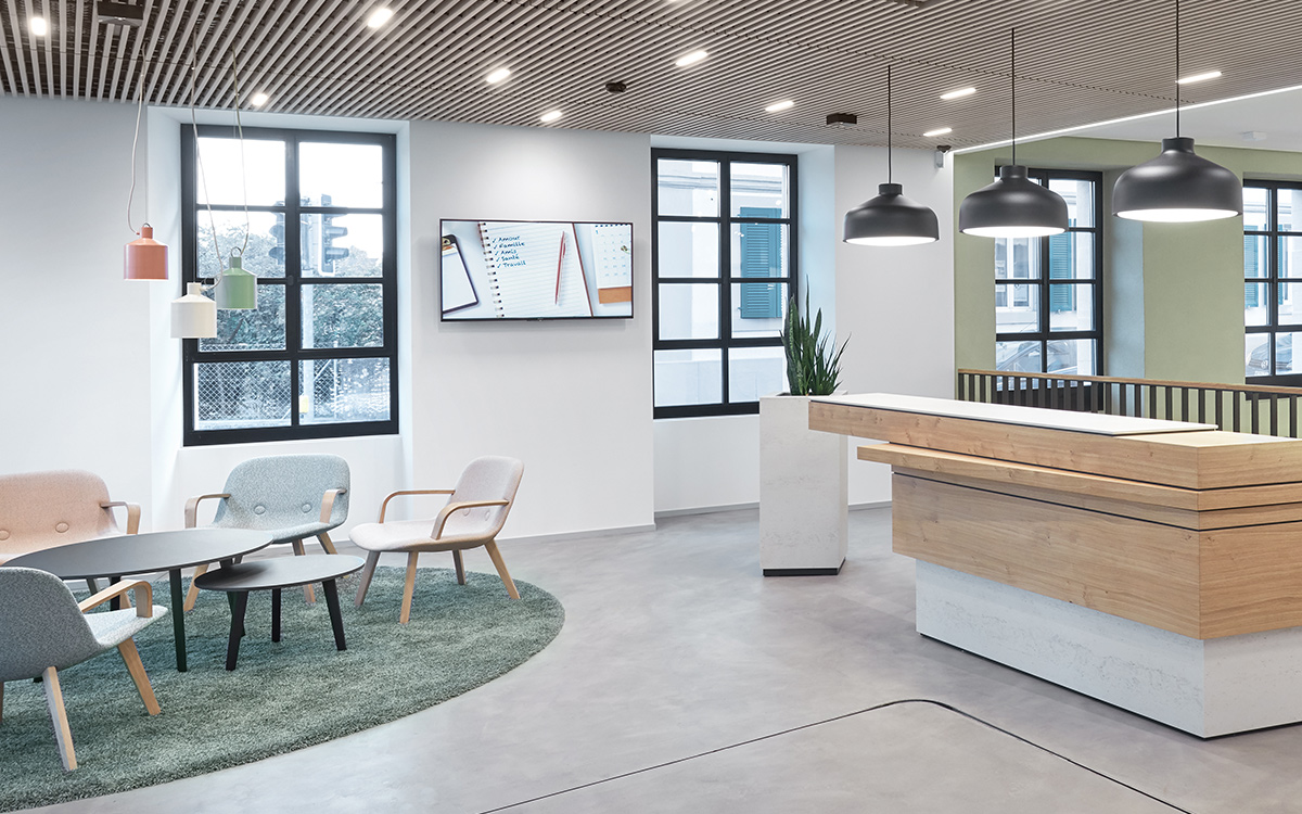
We also paid special attention to the lighting of customer areas; in cooperation with lighting technician Ulrich Reichardt, we developed an LED spotlight that fits perfectly into the wooden lamella ceiling, providing balanced, congenial lighting.
Design
Design and the use of materials were inspired by the cultural heritage of the Gros-de-Vaud region and its surroundings.
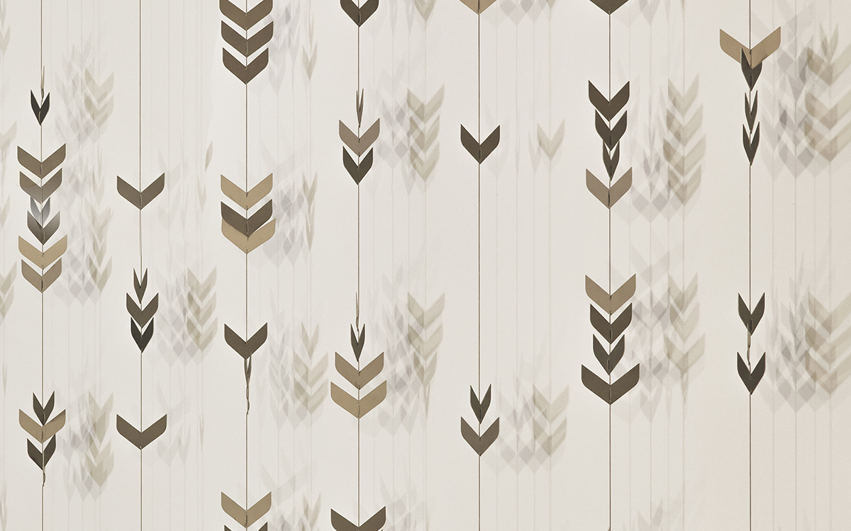
We can all picture the scene — wind blowing over the wheat fields, creating typical, rhythmic movements. The landscape, with its fields all around Echallens, served as inspiration for the scenography of the Raiffeisenbank.
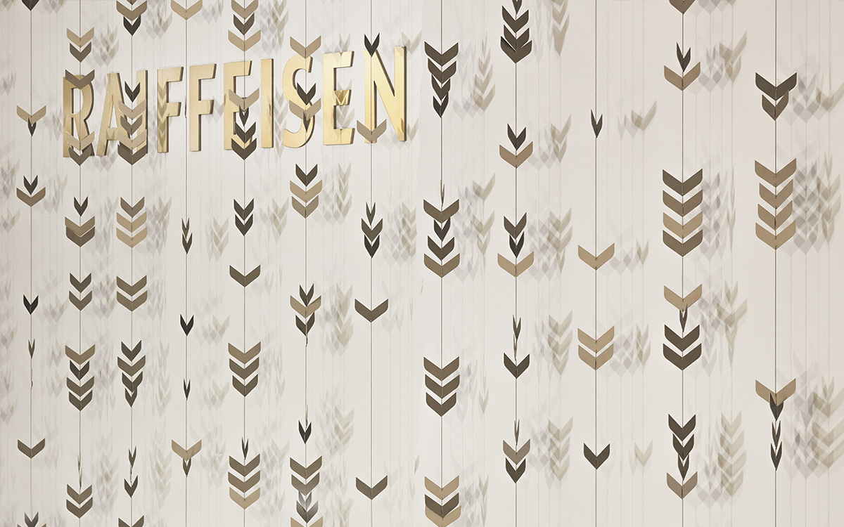
The ear of wheat — a regional symbol — has been used as a graphic and a three-dimensional element for the brand wall of the customer zones, where the wheat grains sparkle and vibrate with intense finesse, depending on the light that falls on them and emanates from a custom-made, 5 meter high lighting system.
With refined interplay between light and shadow, we have created a kind of abstract wheat field that gives life and structure to the vertical wall connecting the basement and the lower ground floor.
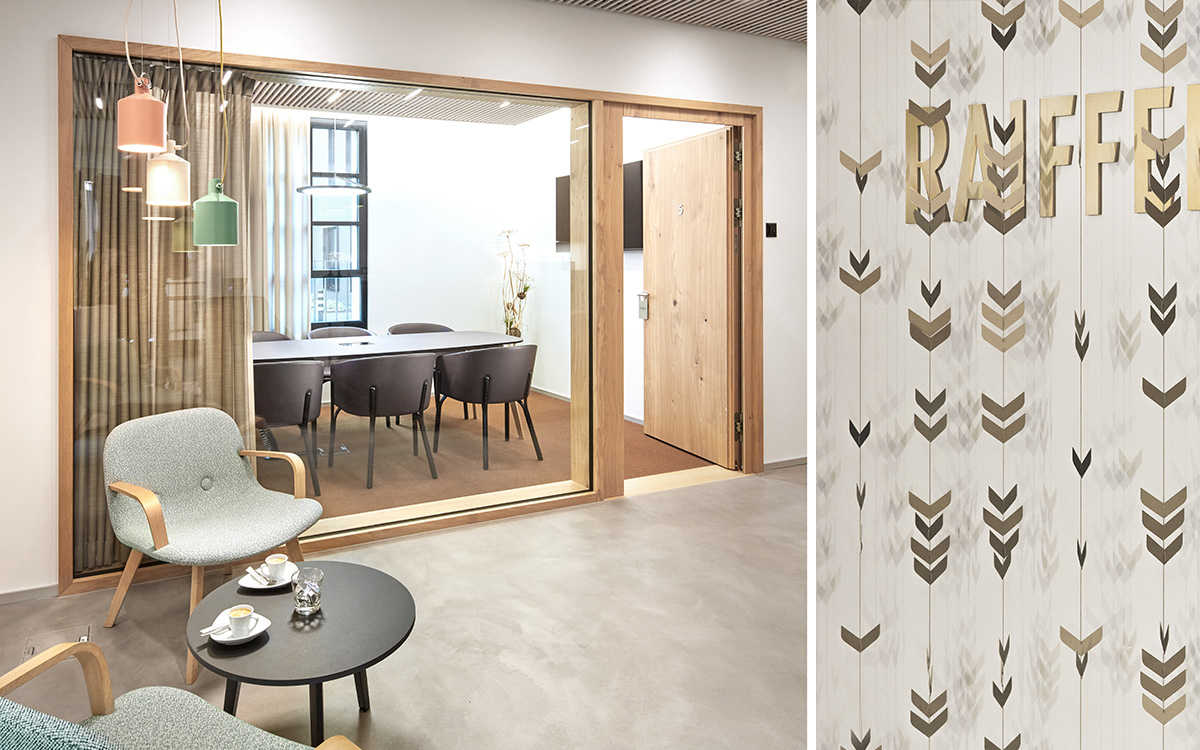
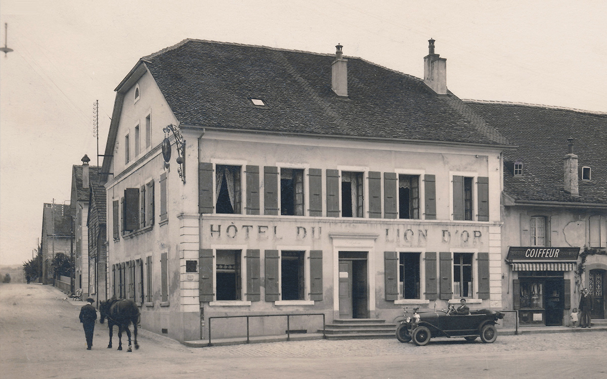
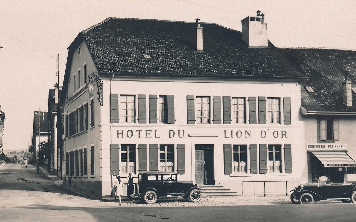
It is readily apparent that the former Auberge du Lion d’Or was the starting point for the conceptual planning of the consulting rooms. Our idea was to integrate the doors and glazing into frames, with a curtain system for discretion and a specific signalling system to pick up the language of a country inn in a more contemporary fashion.
The rustic oak wood especially selected for this project is an allusion to the Echallens coat of arms, which is emblazoned with an oak tree.
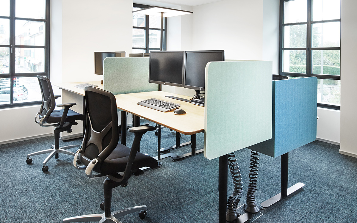
Aerial photographs of the surrounding fields with their clearly defined parcels of land inspired us to create our concept for the use of materials for the floor, selecting different carpet colours for the consulting rooms, echoed in the choice of curtains and fabrics. This resulted in a colour code for each individual room, such as a field of wheat or barley.
Our brief
Raiffeisenbank entrusted us with the conceptual planning, the organisation and the ‘look and feel’ of the customer zones and the new working environments; this included plans for the interior design, signalling and lighting (the conceptual planning and development of basic lighting as well as the light well). 3demArch was responsible for the architectural project and construction management.
We would like to thank Raiffeisenbank Gros-de-Vaud for its trust and the constructive, extremely positive collaboration.
Do you like what you see? Do you have a similar project in mind or would you like some detailed information?
We would be pleased to advise you competently and personally.
Contact us →
